Unilever - meu mercado em casa
Multi-marketplace for groceries for Unilever in Brazil.
Meu Mercado em Casa
Company
Meu Mercado em Casa
Unilever
When
2020
ROLE
Product Designer
Platform
Web
iOS
Android
goal
To provide a comprehensive e-commerce experience that connects consumers directly with multiple markets and supermarkets. This platform was designed to simplify the online grocery shopping process, especially during the pandemic in 2020, making it accessible and efficient for end-users.
context
During the pandemic, supermarkets faced unprecedented challenges in meeting consumer demand while ensuring safety. "Meu Mercado em Casa" emerged as Unilever's response to this critical need. This initiative was designed not only to provide essential support to supermarkets but also to reinforce Unilever's brands by facilitating access to groceries online. In a time when physical shopping posed health risks, this platform offered a timely solution, allowing consumers to shop from the safety of their homes while maintaining brand visibility and engagement.
process
The process of bringing "Meu Mercado em Casa" to life began with a deep dive into understanding the existing capabilities of the platform and identifying what needed to be built from the ground up. A significant early challenge was to develop a new visual identity, including a logo, that would resonate with users without an established branding guide. Collaboration was key, requiring seamless coordination between the tech team in India and the product team in Brazil to ensure technological alignment and integration.
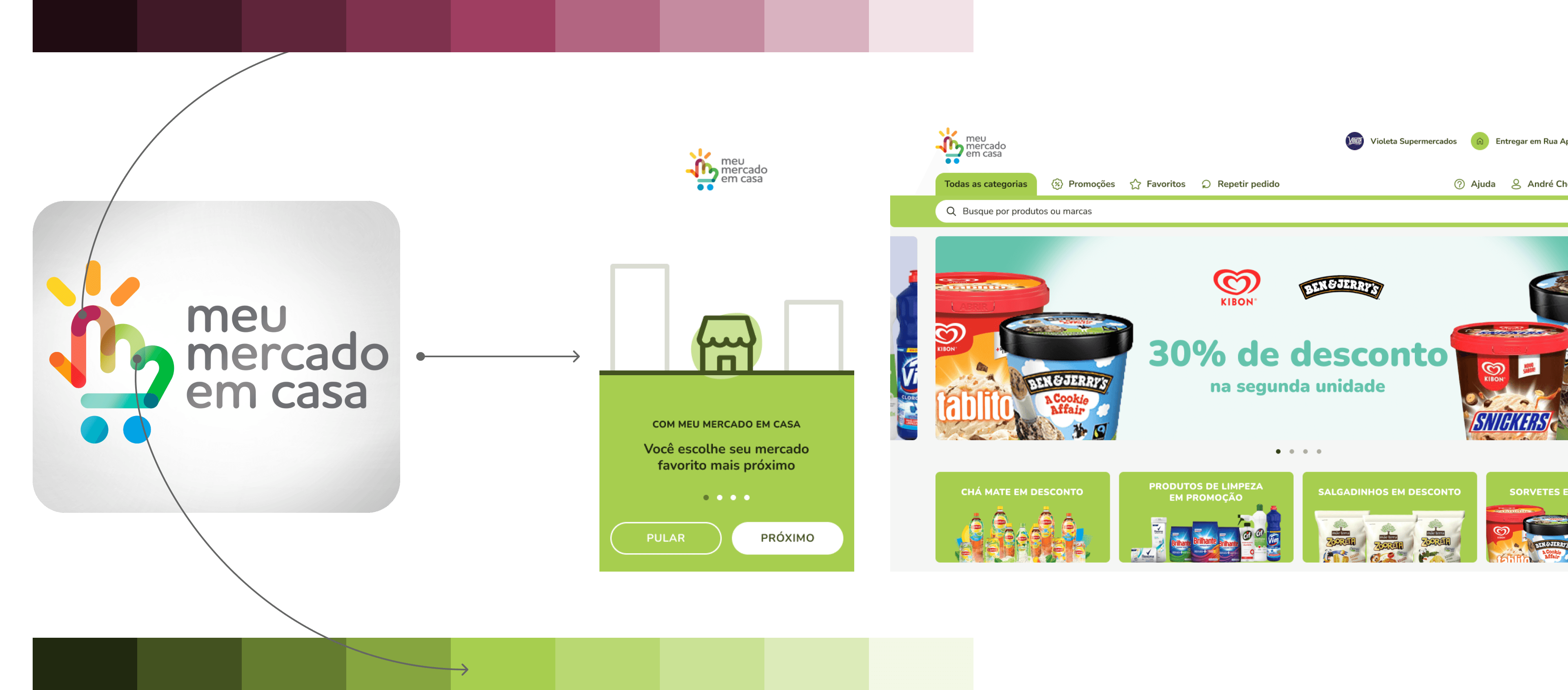
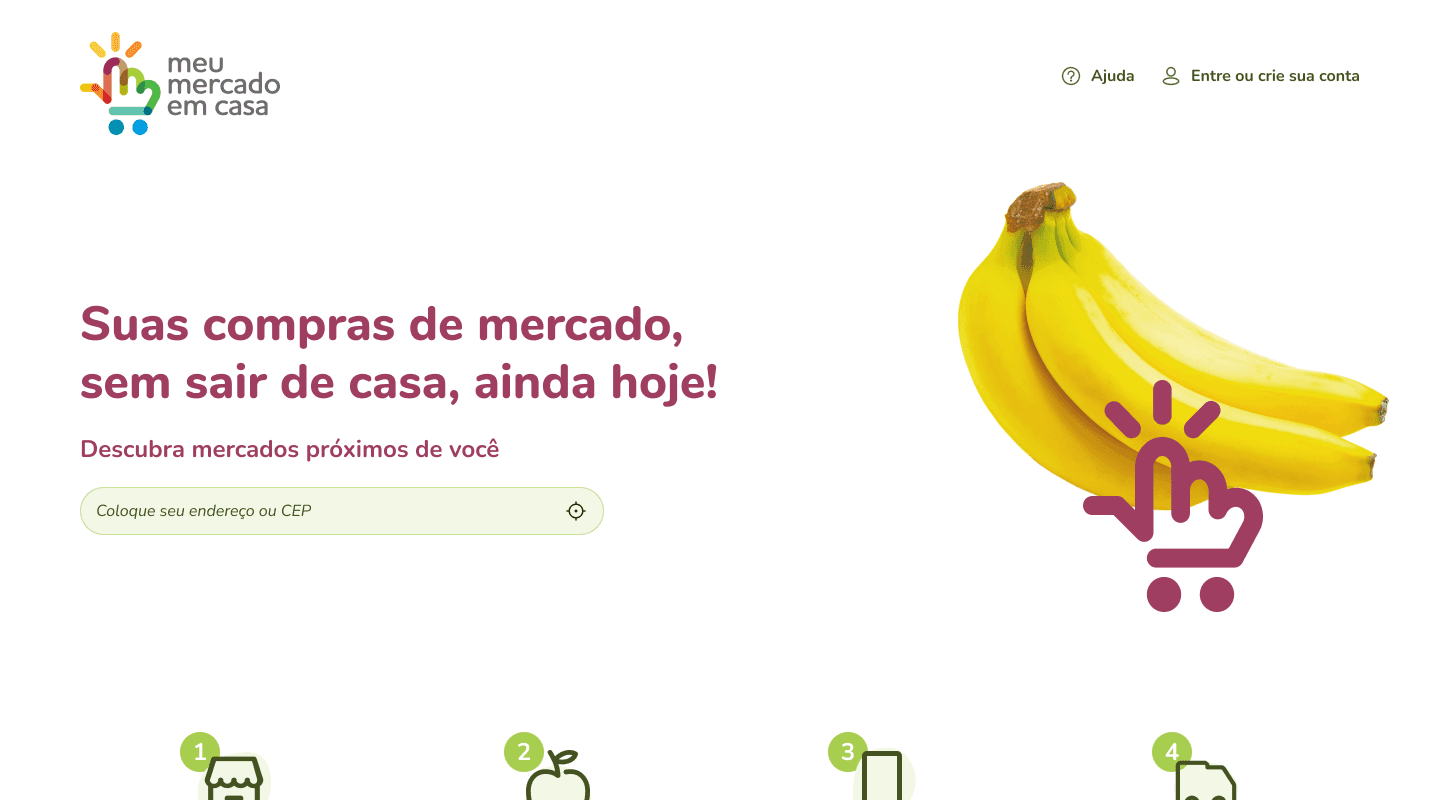
Branding created based in the logo

platform map
Building
The building phase involved crafting the visual identity that would define the user interface, creating a comprehensive design system adaptable across web and mobile platforms, and mapping out user flows based on necessary features and development parameters. This stage was crucial in visualizing the user journey and setting a clear direction for the platform's development.
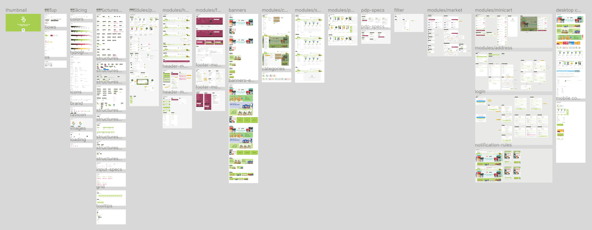
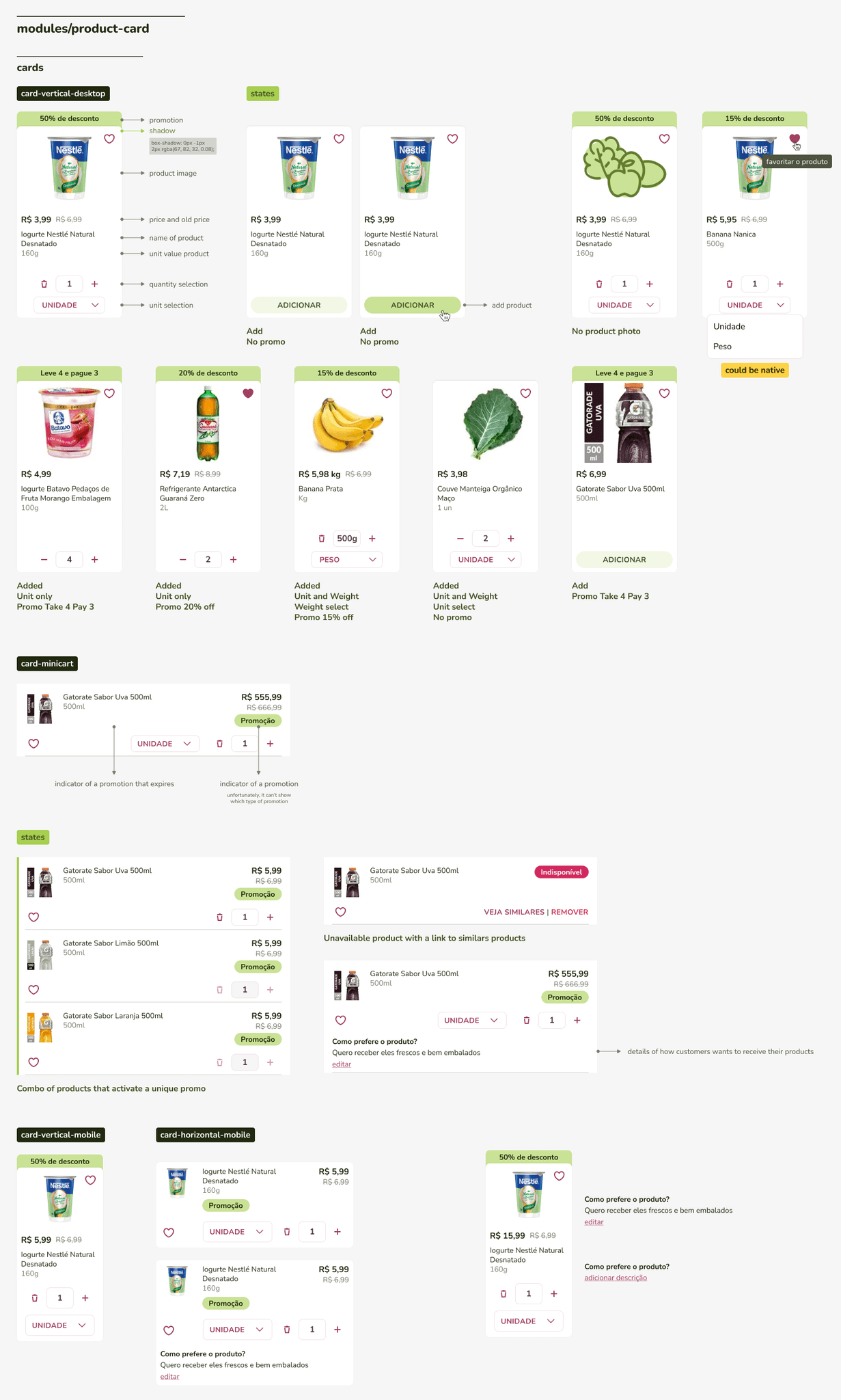
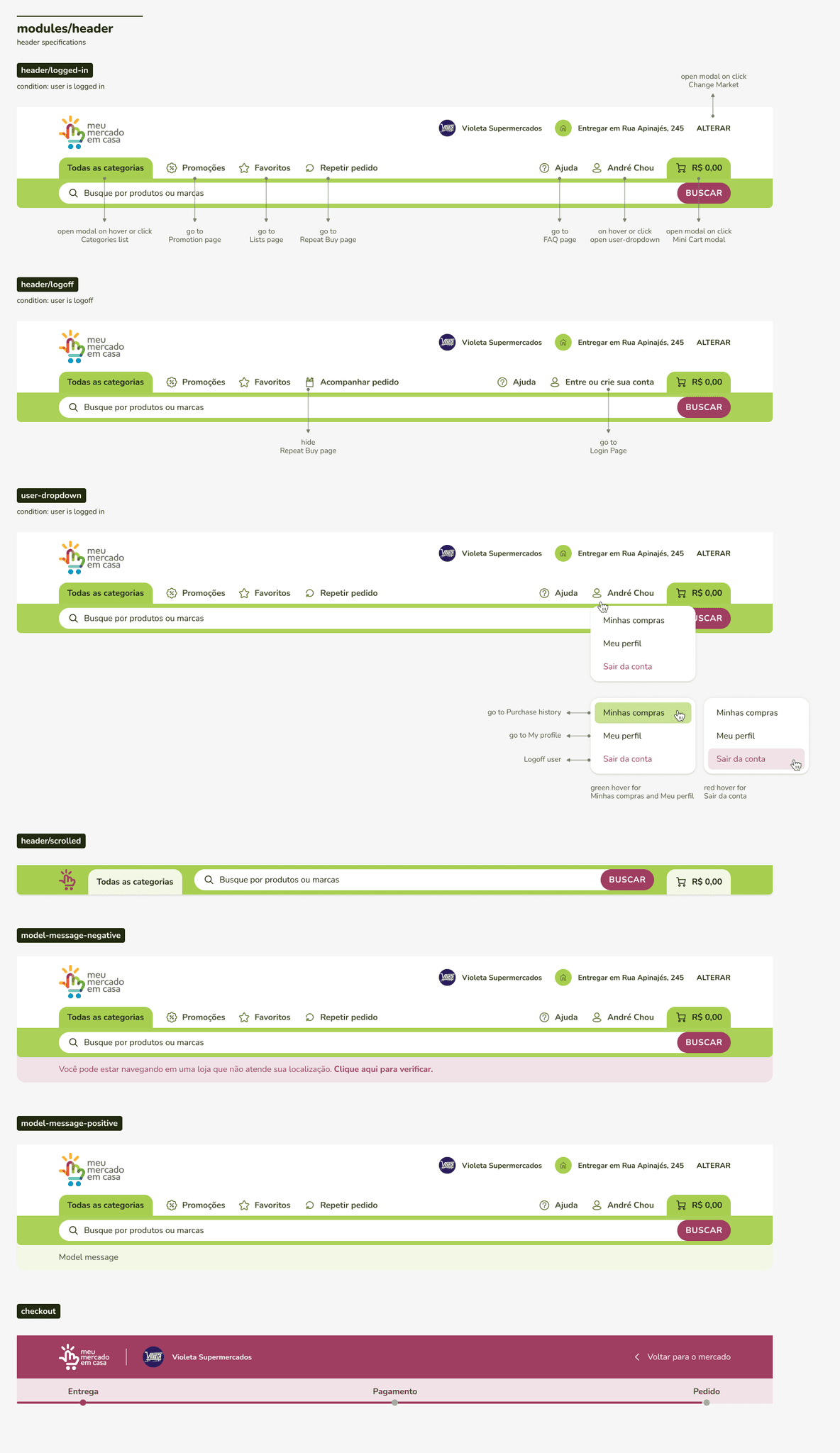
Design System
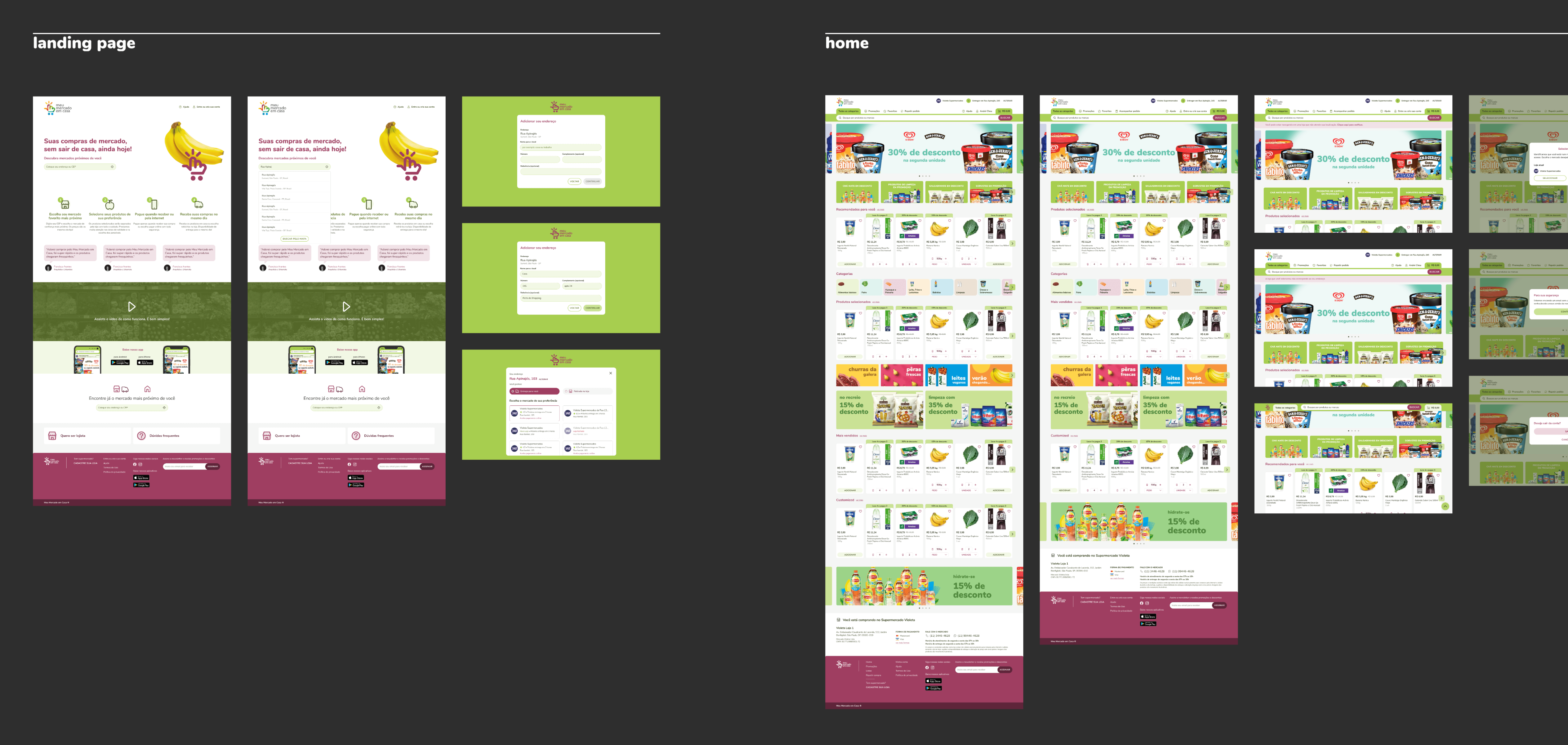
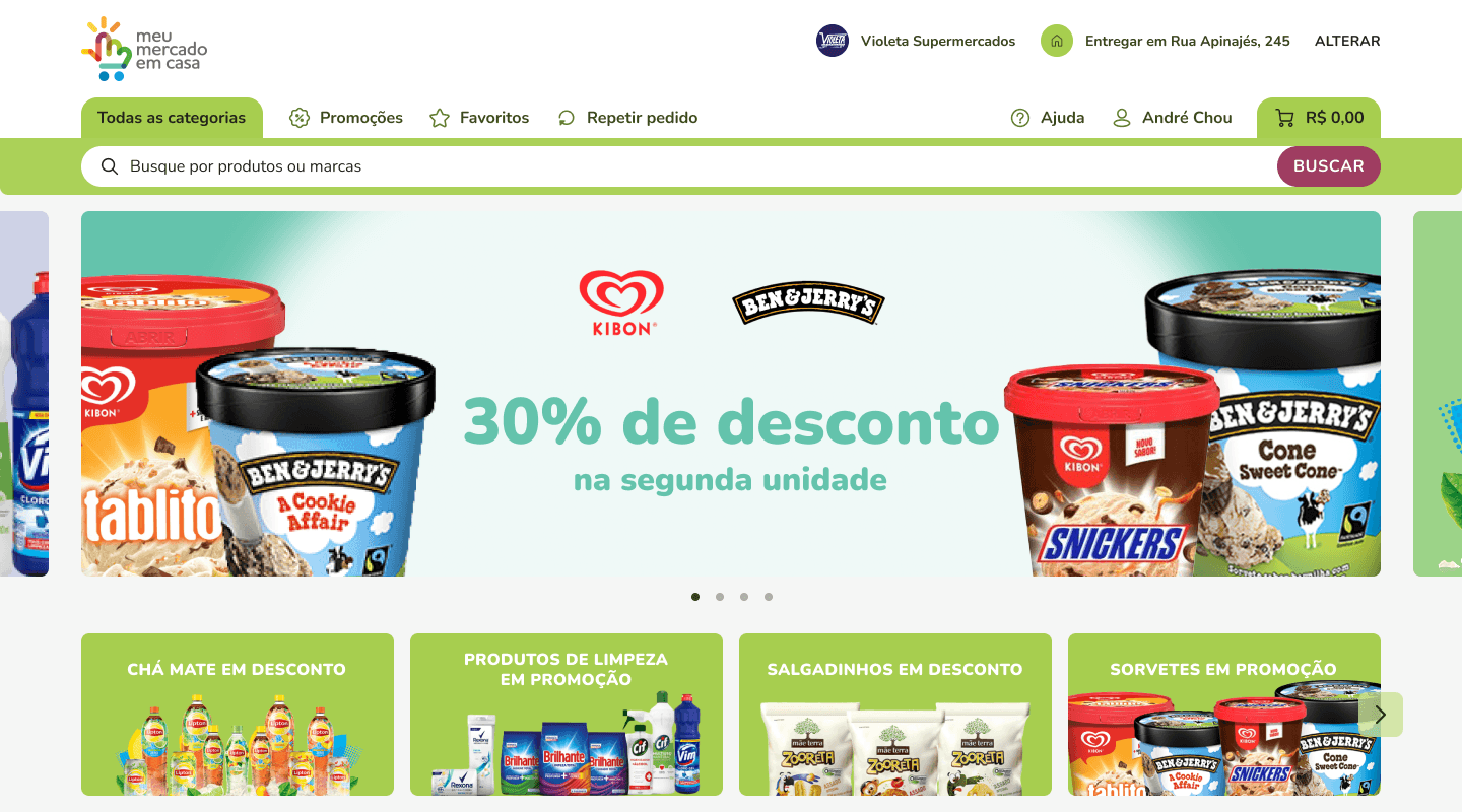
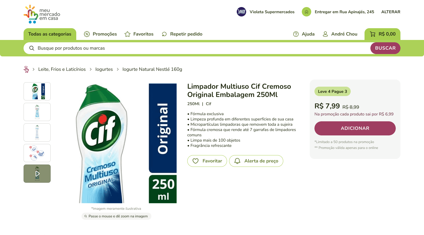
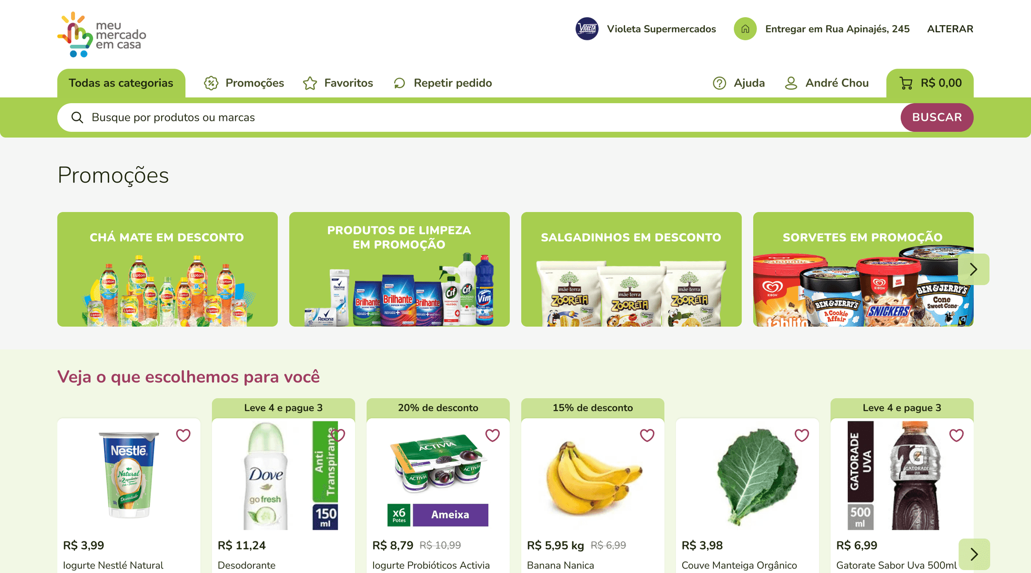
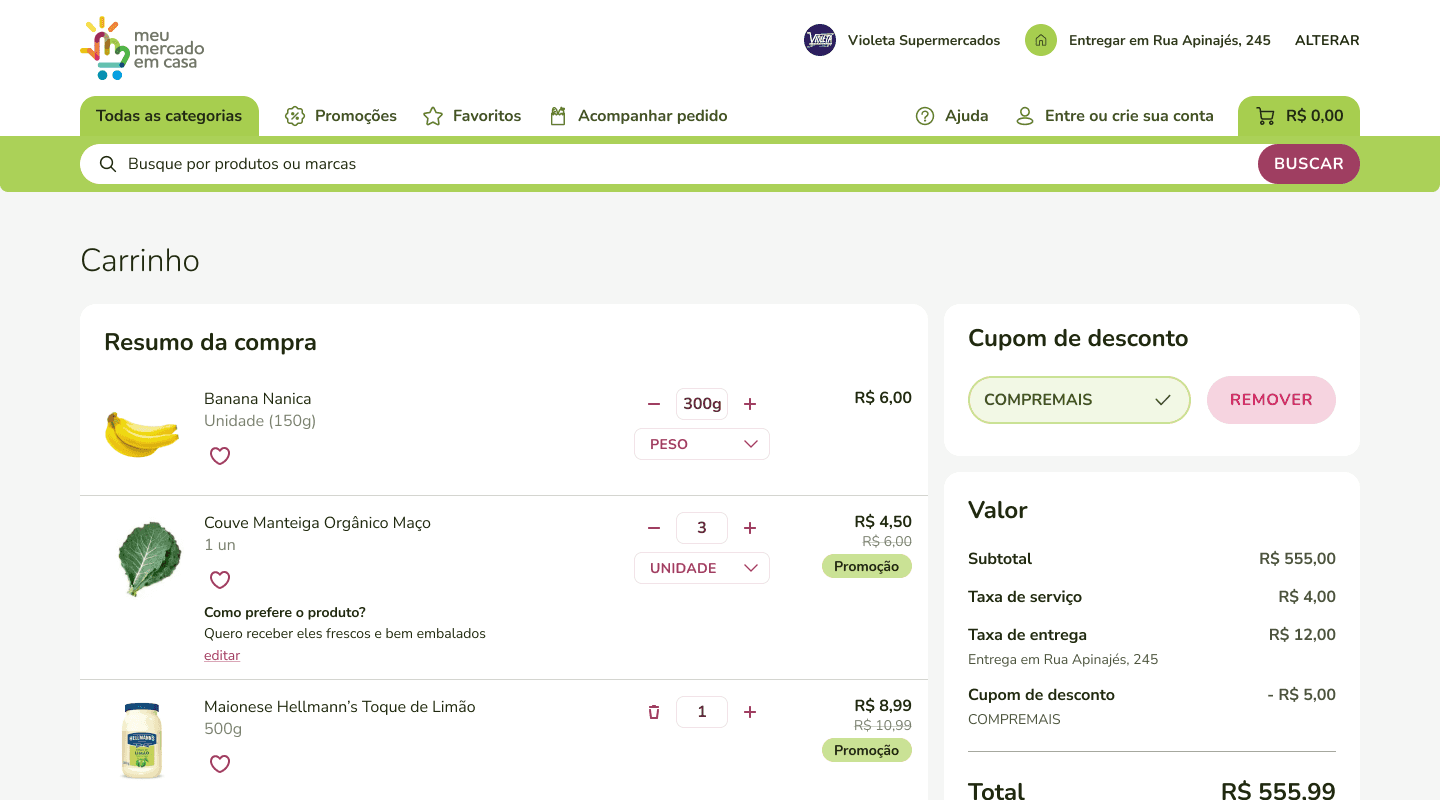
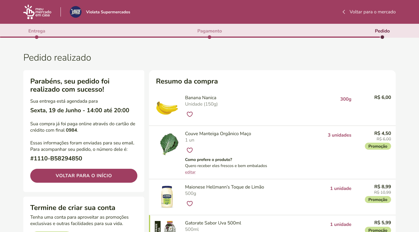
Desktop Screens
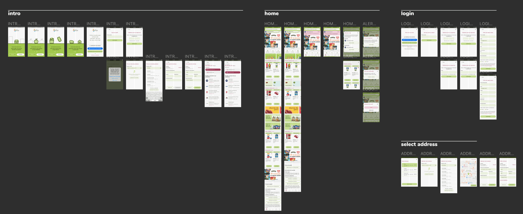
Mobile screens
Prototyping
Prototyping focused on our target audience, primarily Brazilian women of low to medium income, mostly using Android devices. Initial prototypes were created using Figma, with remote testing facilitated by Lookback. However, performance issues on lower-end devices led us to switch to Invision, which offered a smoother experience. This phase was instrumental in refining the platform based on user feedback, simplifying processes to enhance usability.
Prototype
Handoff for Development
The final handoff to development included detailed specifications for each component, comprehensive screens outlining user journeys and scenarios, and designs optimized for desktop, mobile web, and mobile app. This ensured a unified and engaging user experience across all platforms, marking the culmination of a meticulously planned and executed development process.
